Product Design — 2026Currently in development
Bringing clarity to a complex tracking product
PAJ's GPS app supports very different users: people tracking a car, pet, or family member, as well as professionals managing multiple assets and users.
Over time, the product had become difficult to navigate. Features and settings had accumulated across the app, hierarchy was inconsistent, and the experience no longer reflected PAJ's renewed brand direction.
My role was to lead the redesign across brand, product strategy, UX, UI, prototyping, testing, and developer handover.
Role
- Brand
- Product strategy
- UX
- UI
- Prototyping
- Testing
01
The project was not primarily about making the interface look more modern.
The real challenge was that PAJ needed one product to support very different levels of complexity. A private user with one tracker should be able to quickly understand what matters. At the same time, professional users still need access to more advanced management capabilities.
Design 01/05
Before
After
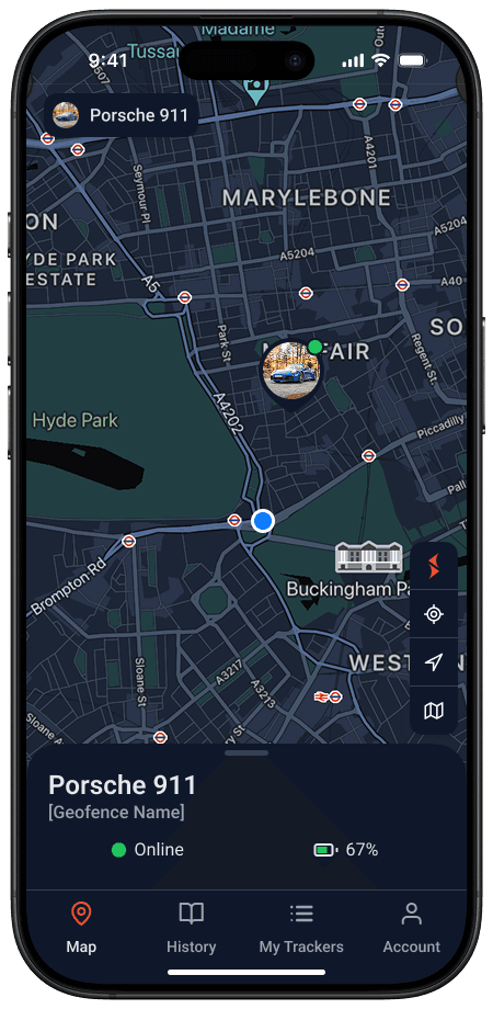
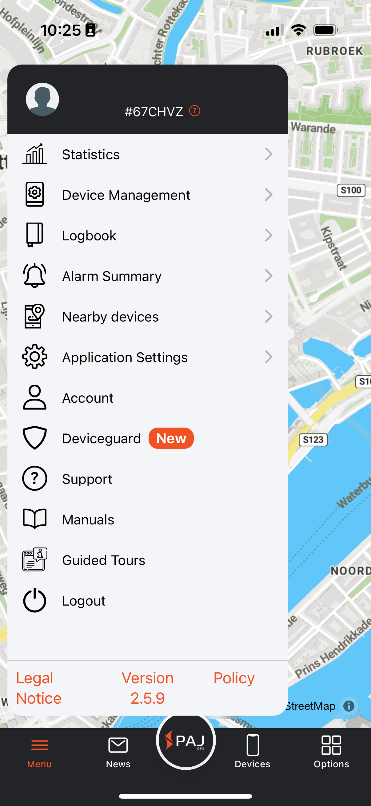
The old menu-driven app, and the redesigned map home.
02
Before designing the interface, I worked to understand where the product had become difficult to use.
I combined stakeholder knowledge with support tickets, app-store reviews, competitor research, and usability testing. The goal was not to document every feature, but to identify where users lost orientation and where the product created unnecessary friction.
A few themes emerged:
- 01The navigation had no clear centre.
- 02Important functions competed with rarely used features.
- 03Tracker context was not always visible enough.
- 04The product needed a clearer distinction between frequent actions and deeper management tasks.
- 05Visual inconsistency made an already complex product feel harder to understand.
This became the foundation for the redesign.
03
Rather than treating every feature as equally important, I restructured the product around different levels of user intent.
At the surface, users should be able to quickly understand the current state of a tracker and take common actions.
When they need more detail, they can move into deeper layers for trip history, configuration, account settings, and management.
This approach allowed the product to support both simple and complex use cases without forcing every user into the same level of complexity.
Design 02/05
Simplified product architecture diagram
Asset to comeThe product, restructured around levels of user intent.
04
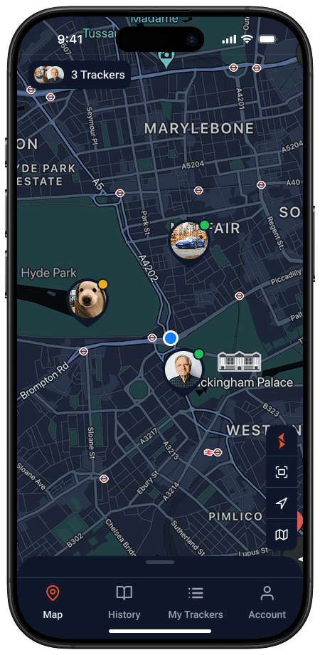
A key part of the work was creating an experience that could scale from one tracker to many.
Instead of designing separate products for private and professional users, I focused on a shared system with progressive complexity:
- 01Essential tracking information remains prominent.
- 02Multi-tracker context becomes more visible when needed.
- 03Advanced management is accessible without dominating the everyday experience.
- 04Desktop extends the mobile product for more structured account and user-management tasks.
This helped create a more coherent experience across different customer types while keeping the core product recognisable and consistent.
Design 03/05
01
02
03
Desktop — account and user management
Screen to comeOne tracker → many → account & user management.
05
The project also required more than individual screen designs.
I created a reusable component structure, interaction patterns, responsive rules, and state definitions across mobile and desktop. This gave the team a clearer design foundation for implementation and future development.
The updated system was aligned with PAJ's broader brand direction, translating ideas such as reliability, security, and innovation into a more consistent product experience.
Design 04/05
Component & UI-state overview
Asset to comeOne design foundation across mobile and desktop — components, patterns, states.
06
The final product design focused on a few recurring user needs:
- 01Quickly checking a tracker's current status and location
- 02Switching between trackers with clearer context
- 03Reviewing trip history and movement information
- 04Managing users and account-related tasks across desktop and mobile
Design 05/05
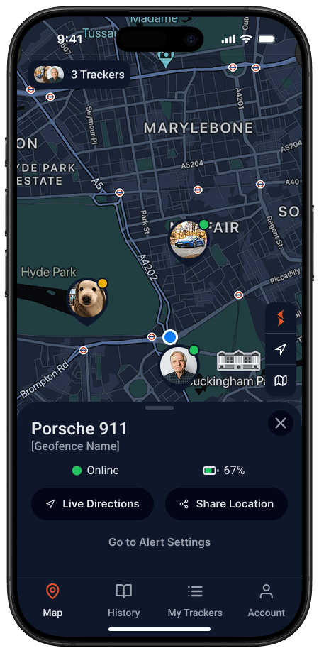
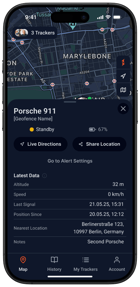
Checking status, switching trackers, reviewing movement — and one flow, recorded from the prototype.
07 — Outcome
The work created a clearer structural foundation for PAJ's product: a more coherent navigation model, a more consistent visual language, and a scalable experience for both individual and professional users.
This project reflects how I approach complex product work: clarify the underlying system first, then design an interface that makes that complexity feel manageable.
More case studies in progress
← Back to home